Wunderbar
Wunderbar
Brand Design
Web Development
A German-style pop-up bar offering an authentic Bavarian experience. From traditional brews to hearty snacks, Wunderbar brings the lively atmosphere of Munich’s beer halls to the bustling streets of London. Prost!
Given the task of crafting a brand identity and website for a pop-up German bar, I fused traditional and modern elements to captivate the London audience, aiming to capture the lively ambiance of German beer halls and dynamic pop-up bars for patrons seeking memorable experiences.
The Brief
Brand Design
I designed a vintage-inspired logo to reflect traditional craftsmanship, complemented by the red, yellow and black of the German flag, emphasising the brand’s traditional roots. The use of bright, bold colors and clean design elements simultaneously infuse a modern, contemporary feel into the brand.


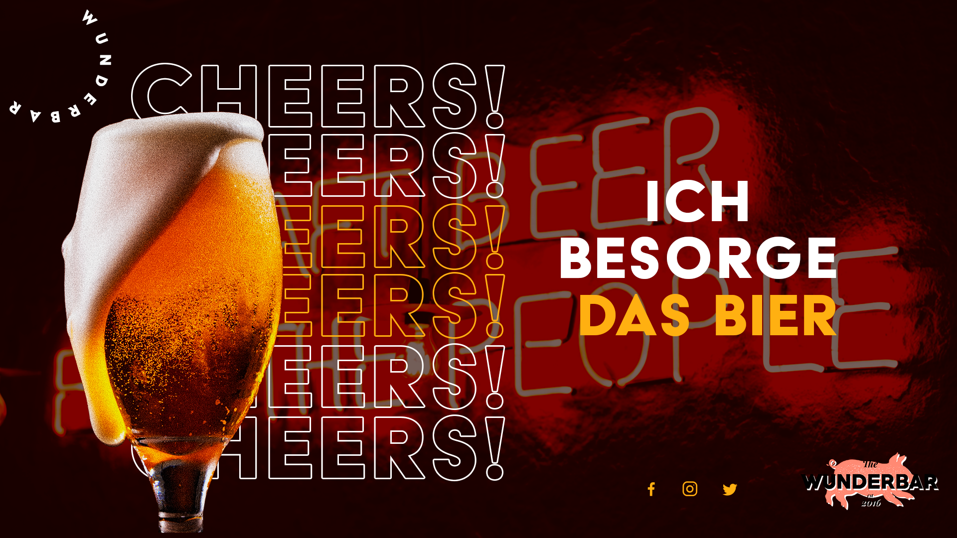
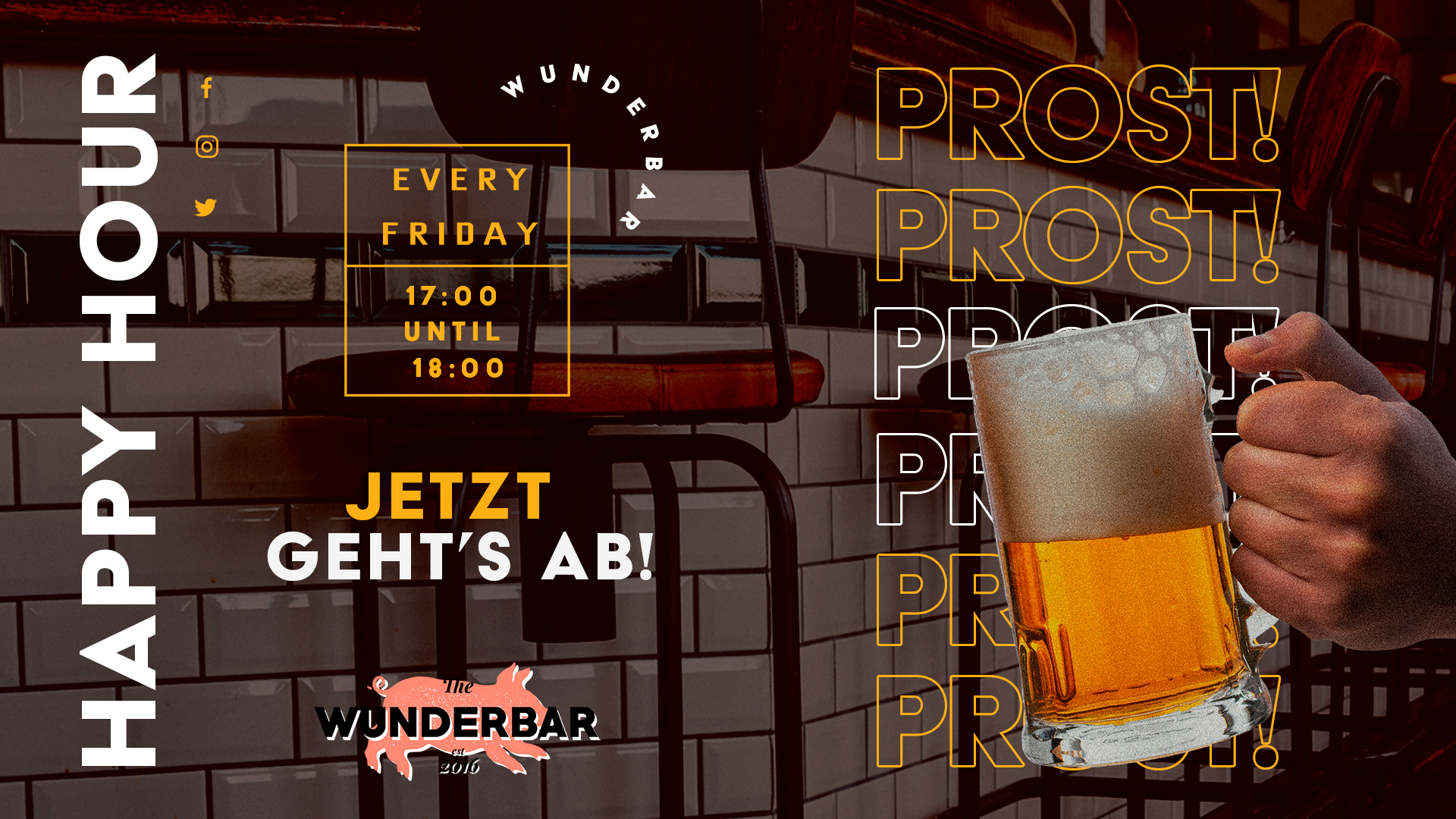
Printed Promos
I created a couple of flyers alongside the branding as a way of explaining how the branding would work. The aim was to add a physical example of the design and how it could be used as a marketing tool, a way to show how the design could reach beyond it’s digital existence.
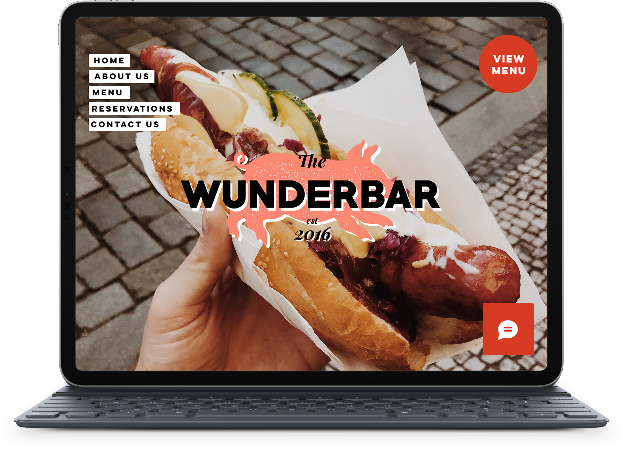
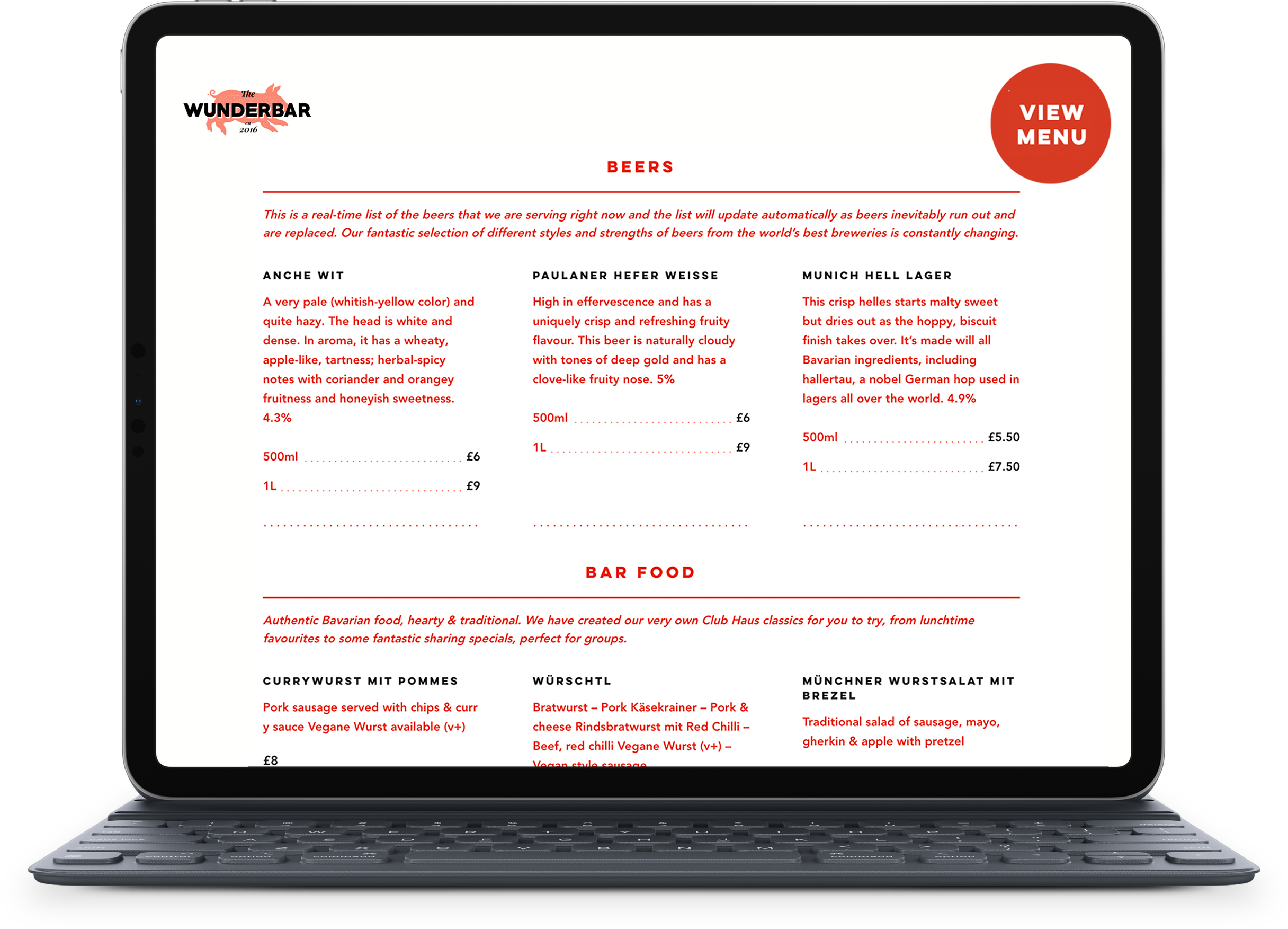
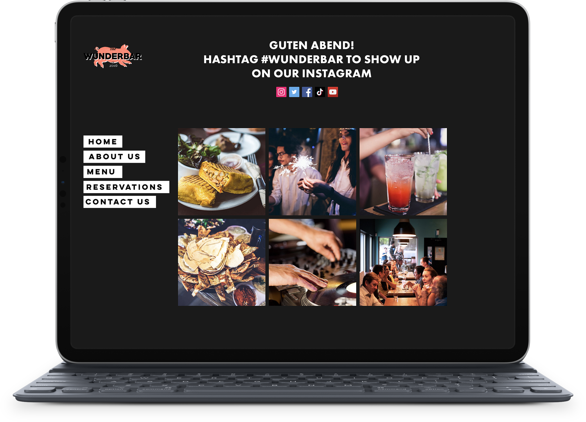
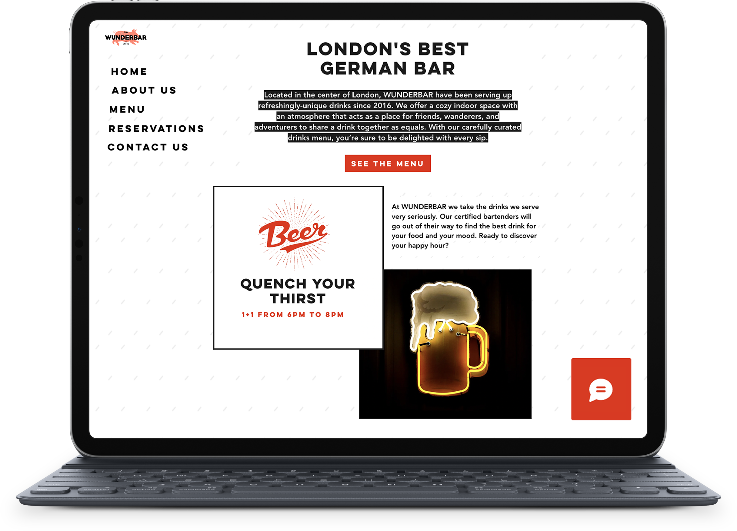
WEB Development
The website serves as a central online platform, offering visitors essential information about the business while embodying its unique identity. Designed to provide visitors with comprehensive information about the business, including menus, booking options and event listings, it offers a user-friendly experience that remains up-to-date and fresh with minimal maintenance.
Emphasising the bar’s temporary nature, the website captures the essence of the pop-up concept while aligning seamlessly with the established design and branding, ensuring a cohesive online presence that resonates with patrons
Content is prioritised and adjusts depending on how the site is accessed, meaning mobile users can quickly find the info most pertinent to them
Responsive Design
The website is designed with responsivness in mind, meaning mobile-first design. The screensize automatically adjusts depending on the device used to view it.
Perhaps even more importantly, the style and content was chosen to reflect how people use the website.
Content is prioritised and adjusts depending on how the site is accessed, meaning mobile users can quickly find the info most pertinent to them, while desktop access results in a broader sense of the business and what they have to offer.


